Micro Animation UX Enhances Experience: A Comprehensive Guide for Designers
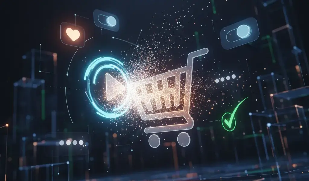
I remember the first time I made the "Add to Cart" button that bounced when clicked, the whole team burst into tears because the interface suddenly came alive. Micro animation UX increases experience is that small miracle, helping to directly solve the problems of page bounce rate and customer engagement.
Why do we designers have to be "addicted" to micro animation right away?
Micro animation acts as the body language of the interface, helping to fill the communication gap between human and machine, thereby subtly enhancing the user experience (UX).
Many newcomers often wonder what micro animation is and why is it important in UX?. Simply put, these are small, single movements that serve a specific purpose. At Pham Hai, we always believe that design is more than just quiet colors.
Integrating motion makes the benefits of micro animation for user experience immeasurable. It turns dry interactions into an emotional conversation. This care helps the product become more professional and trustworthy in the eyes of customers.
Provides intuitive feedback, dispelling the user's "vague" feeling
Visual feedback through movement helps users know immediately that the system has recorded their actions, completely eliminating the confusion of waiting.
Have you ever pressed a button on the screen and wondered, "Hey, has it eaten yet?" then click a few more times? It's a classic error due to lack of visual feedback. When a button changes color or sinks slightly, it signals that user interaction has taken place successfully.
According to the latest UX reports from early 2026, users expect to receive system responses in under 100 milliseconds. Without these small confirmatory movements, they will easily feel impatient. Ambiguity is the number one enemy of good design.
Lead users naturally, reducing cognitive load
Subtle movements act as invisible signposts, directing users' attention where it's needed without overwhelming them with information.
The more features the interface has, the more confusing the user flow becomes. Micro animation helps solve this problem by smoothing out the navigation process. For example, when a menu slides out from the edge of the screen instead of appearing suddenly, it helps the brain understand the source of the information.
This contributes to optimizing ease of use, helping users not have to waste time thinking about where they are. A good interface is one that does not force users to "learn" how to use it from scratch.
Increase conversion rates and retain users incredibly effectively
Compact effects reduce friction during manipulation, thereby keeping users engaged longer and motivating them to complete their conversion goals.
Many customers often ask me how micro animation helps improve conversion rates?. The latest 2026 statistics on Medium have shown that a good motion feedback system can help increase overall conversion rates by 23% and on mobile by up to 31%.
When users feel happy and secure, retention rates will automatically increase. At the same time, fun waiting effects also play a key role in reducing page bounce rate when the system needs time to load data.
Bring your brand to life in every smallest detail
Movement imbued with brand personality helps the product become memorable and completely different from thousands of competitors in the market.
Never underestimate the importance of micro animation in branding. A fun, dynamic bounce is perfect for entertainment apps, while an elegant fade is made for financial apps.
Thẩm mỹ thiết kế hiện đại không chỉ nằm ở màu sắc hay font chữ, mà còn ở cách mọi thứ chuyển động. Khi đồng bộ được nhịp độ và phong cách chuyển động, bạn đang thực sự xây dựng thương hiệu ngay trong tiềm thức của người sử dụng.
"Secrets" for implementing real-life micro animation for designers
To design effective motion, designers need to adhere to functional principles, understand the differences between concepts, and know how to place effects at the right touch points.
The guide to implementing micro animation in UI/UX design requires a certain level of sophistication and moderation. As a UX/UI Designer or Product Designer, you should not add effects carelessly. Below are the actual combat experiences that I have gathered.
Golden rule: Always start with function, then add "delight"
Movement must first solve a specific user problem, then consider the element of delight to avoid cluttering the interface.
This is the most important micro animation design principle to increase interaction. Don't make things fly by the seat of your pants just because you know how to use the software. Always ask yourself: Does this effect help users understand information faster?
Applying these standards is essential to ensure accessibility for all audiences. To master this mindset, you can refer to Modern UI Design Principles 2026 to update the latest standards. A "delight" effect should last less than 300 milliseconds.
Clearly distinguish between Micro animation and Microinteraction
Microinteraction is the entire interaction process from start to finish, while micro animation is just the visual feedback part of that process.
Many newbies still confuse the difference between micro animation and microinteraction. In essence, Microinteractions is a loop consisting of 4 core parts as shown in the table below:
| Ingredient | Practical meaning | Illustrative example |
|---|---|---|
| Trigger (Kích hoạt) | Action begins interaction | User clicks on the "Like" button |
| Rules (Quy tắc) | Processing system logic | The system records +1 Like |
| Feedback (Phản hồi) | Micro animation hiển thị | The heart enlarges and changes color to red |
Micro animation is the "Feedback" part - what our eyes see. Understanding the true nature helps you coordinate with the programming team much more smoothly.
"Prime" locations to place micro animation: Buttons, loading effects, state transitions
Frequent touch points like call-to-action (CTA) buttons, loading screens, and input forms are the best places to add effects.
Not every position on UI design can fit motion. Buttons (Buttons) are the number one priority, because this is the most obvious physical communication point.
Next are the Loading states – weapons that help turn boring waiting time into an exciting moment. Finally, status transitions (such as from "Unsaved" to "Saved") require a slight movement to confirm the action.
"Bloody" experience: Mistakes to avoid so animation doesn't become a disaster
Overuse of duration, lack of consistency, and ignoring users with low-end devices are common mistakes that can ruin the entire experience.
From a product management perspective, a cumbersome animation can ruin the entire flow of the experience. The biggest mistake I often see is making the animation too slow, making modern users feel frustrated.
The second mistake is the lack of uniformity in motion design. You can't let the "Save" button bounce and the "Cancel" button randomly fade out. To completely solve this problem, building a Design system to create a consistent design system is extremely important, helping to manage all effects centrally.
What "tools" for designers? Choose the right tool, double the efficiency
Choosing the right tool depends on the complexity of the effect and the workflow between the design team and programmers.
Finding the best micro animation tool for designers is always a hotly discussed topic. By 2026, the market has a very clear differentiation of tools. Depending on the purpose of use, we will have different weapons.
Figma: Fast, compact, agile for basic animations and prototypes
Figma's Smart Animate feature and supporting plugins help designers create interactive prototypes quickly right on one platform.
Figma vẫn là "chân ái" cho các luồng công việc thiết kế hàng ngày. Tính năng Smart Animate của nó đã quá đủ để mô phỏng các tương tác cơ bản cho khách hàng xem.
Recently, plugins like Jitter on Figma help export motion files directly without the need for third-party software. It's great for prototyping, helping the whole team visualize ideas before spending resources on actual coding.
Adobe After Effects & Lottie: "The perfect pair" for complex movements
The combination of After Effects and the Lottie format provides unlimited creativity with extremely compact file sizes, optimized for all platforms.
When you need sophisticated illustration effects, Adobe After Effects combined with Lottie is an unbeatable choice. Lottie uses the JSON file format, which is 10 to 100 times smaller than a GIF image.
At Pham Hai, we often use this combo for celebration animations on mobile applications or website. It's both beautiful, never breaks focus, and friendly to system performance.
Animation CSS/JavaScript: When you want control over every detail
Writing code directly in CSS or JavaScript allows for maximum performance optimization and precise frame-by-frame control of the effect in the browser.
Sometimes, the best way to get a perfect effect is to code it yourself. Animation CSS is extremely light and smooth for hover, focus or color change effects. If you want to practice on your own, the article Create beautiful CSS animations without JavaScript will be a great reference.
Meanwhile, JavaScript Animation shines in complex interactions that require physical calculations. For coders who want to get into product development, Learning UI/UX Design for developers will help you completely master the combination of code and user experience.
Looking in action: Effective game-changing micro animation examples
Analyzing real products helps us understand how technology giants apply motion to retain millions of users every day.
A hundred hearings are not as good as one seeing. Effective micro animation examples in websites and applications are the most vivid learning resources. Let's dissect how subtly they did it.
Analyze successful examples from major websites and applications
Apps like Asana, Slack or Stripe all use micro animation as a core feature to increase user interaction and fun.
Do you remember the unicorn flying across the screen every time you complete a task in Asana? It's a classic example of gamification incorporating motion. Or like Slack, the smooth messaging effect creates a feeling of instant, very reliable response.
Stripe is famous for its subtle background effects that do not distract but create a space with depth. These small details have contributed to shaping global UX standards in 2026.
Performance optimization: How to make animations smooth on all platforms?
Optimizing file size and leveraging GPU hardware power is key to ensuring motion doesn't lag the user's device.
Optimizing micro animation performance on digital platforms is a must. No matter how beautiful an effect is, if it causes battery drain or lag, it is counterproductive.
Lời khuyên của mình là luôn ưu tiên sử dụng CSS transform và opacity, vì chúng được xử lý trực tiếp bởi GPU, giúp khung hình luôn đạt mức 60fps. Tuyệt đối tránh animate các thuộc tính như width, height hay margin vì nó ép trình duyệt phải vẽ lại toàn bộ layout, gây nặng máy cực kỳ.
In short, micro animation UX increases experience is not something "it's okay to have it, it's okay not to have it". For a dedicated designer, it is an indispensable part of creating memorable products. Starting from the smallest details like a button, an icon that "moves", you are gradually building a strong emotional bond with the user. Don't just design static, make your interface "breathe".
Do you have any favorite examples of movement? Or are you having difficulty convincing your boss to give you more time to work on effects? Please share in the comments section below so we can learn and discuss together!
Lưu ý: Các thông tin trong bài viết này chỉ mang tính chất tham khảo. Để có được lời khuyên tốt nhất, vui lòng liên hệ trực tiếp với chúng tôi để được tư vấn cụ thể dựa trên nhu cầu thực tế của bạn.

![Fulfillment Center Việt Nam Giao Hàng Nhanh [Giải Pháp Tối Ưu]](https://phamhai.s3.vn-hcm-1.vietnix.cloud/wp-content/uploads/2026/03/ai-fulfillment-center-viet-nam-giao-hang-nhanh-giai-p-featured-808-600x400.webp)